BRANDING & IDENTITY
Storey and Spaces: A Harmonious Blend of Built Form and Environment
The art direction and identity design for Storey and Spaces were developed to reflect the studio’s philosophy of creating architecture that is localized, bespoke, and deeply integrated with its surroundings. Specializing in urban planning, building design, and landscape architecture, Storey and Spaces aims to elevate the quality of life through thoughtful, enduring structures that stand the test of time. Our goal was to design a visual identity that not only encapsulates the studio’s design ethos but also emphasizes the relationship between built environments and the natural world.
Logo Concept
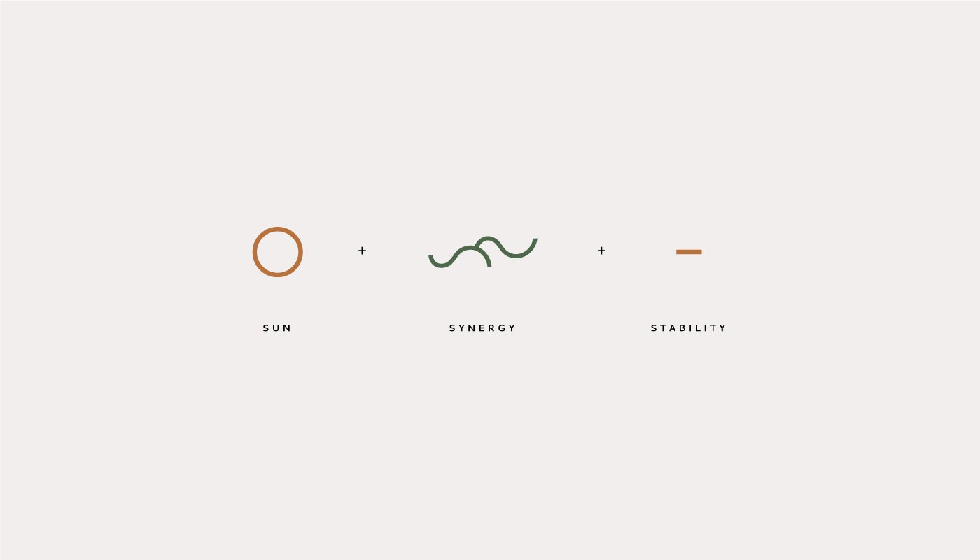
The logo was designed to symbolize the connection between the built form and its surroundings. Its circular shape represents unity and completeness, reflecting the idea that architecture must be in harmony with its environment. The logo is built around three core concepts: Sun + Synergy + Stability.
The circular shape of the logo is versatile and adaptive, much like the studio’s approach to designing architecture that responds to its unique environment. Whether applied to digital platforms, print collateral, or architectural signage, the logo evolves in response to its surroundings, much like the built forms designed by Storey and Spaces.

Sun
Representing life, growth, and energy, the sun symbolizes the positive impact that thoughtful architecture can have on communities.
Synergy
The interlocking elements within the logo signify the relationship between different design disciplines—urban planning, building design, and landscape architecture—working together in harmony.
Stability
The strong, grounded form of the logo reflects the studio’s commitment to creating durable, lasting structures that stand resilient over time.
Typography & Design Elements
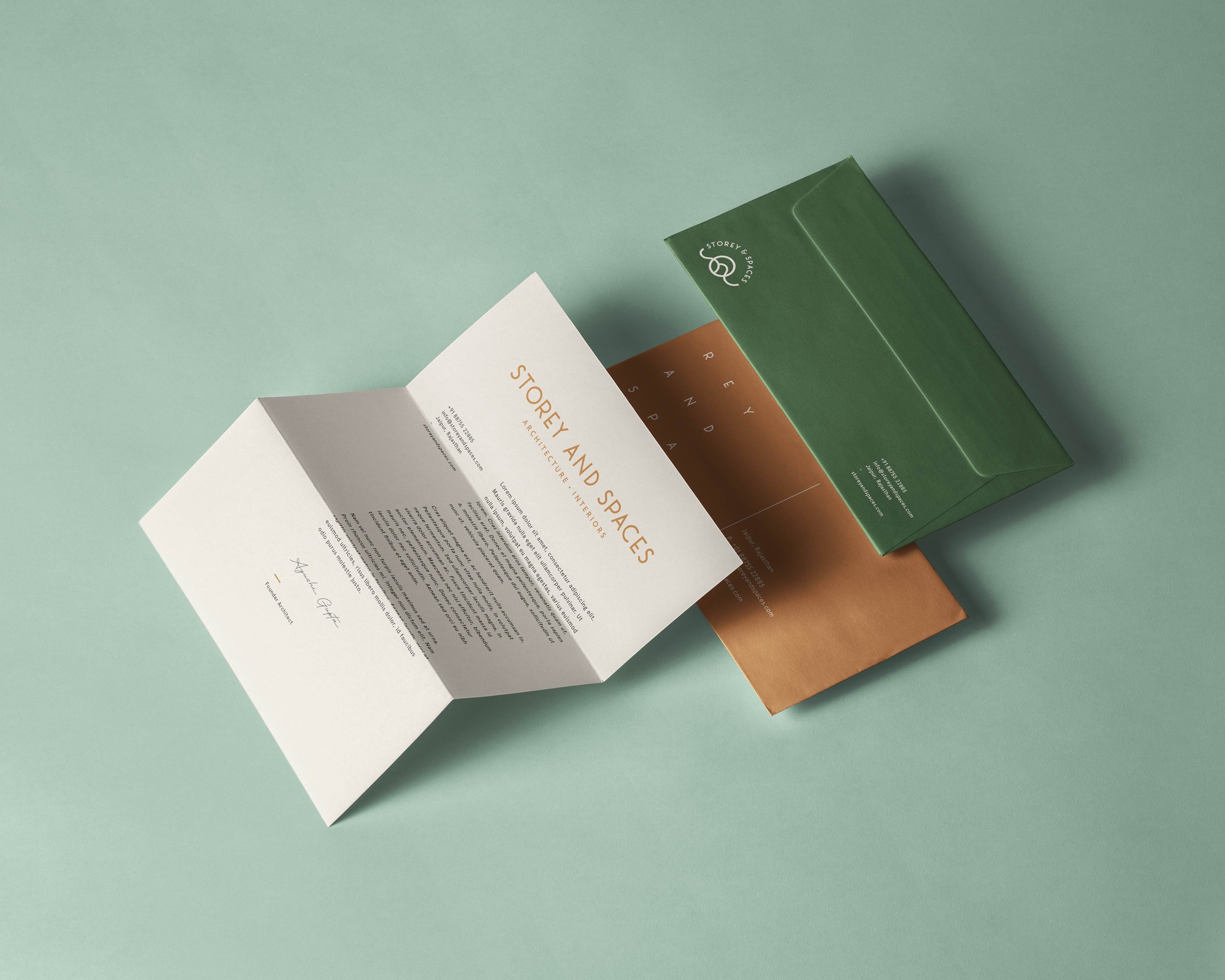
The typography is clean and modern, with a focus on readability and elegance. A balanced use of sans-serif fonts reflects the studio’s modern yet timeless approach, while subtle variations in weight and spacing create a visual rhythm that mimics the thoughtful design of spaces themselves.
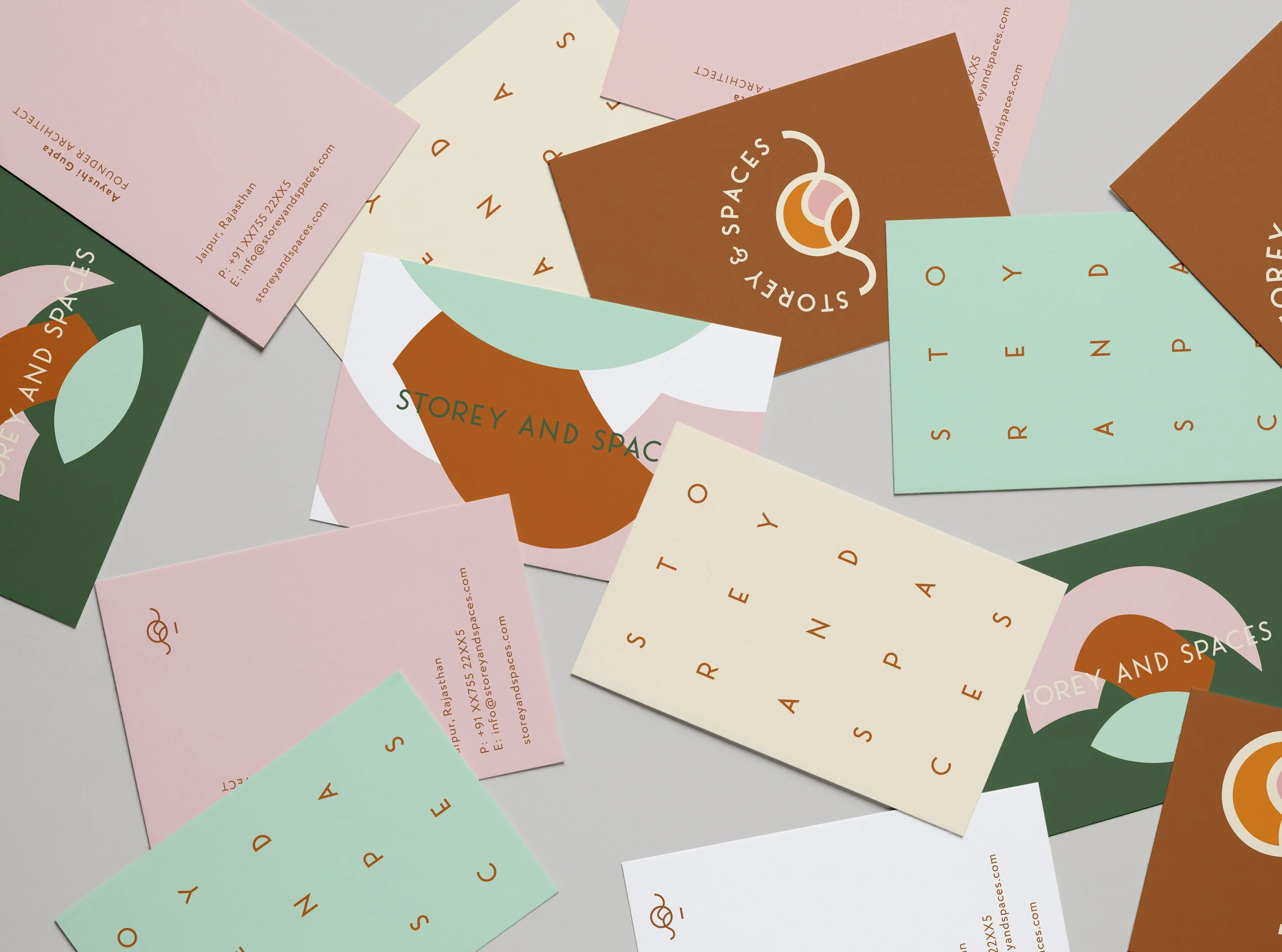
The design elements used throughout the brand’s visual identity draw inspiration from the circular logo. Soft, flowing shapes and repeated circular motifs are incorporated across collateral, echoing the studio’s vision of creating spaces that adapt to and interact with their environments.
The design captures the essence of the studio’s ethos, using a visual narrative that reflects the harmony between built form and its surroundings.
This project brings Storey and Spaces’s vision to life, weaving together urban planning, building design, and landscape architecture into a comprehensive, adaptable identity that mirrors the studio’s holistic approach to design. The visual identity as a whole was crafted to highlight Storey and Spaces’s special emphasis on the relationship between architecture and the environment. The logo, which adapts to various contexts, is a direct metaphor for how the studio’s designs evolve based on their surroundings. The use of circular shapes and natural tones throughout the brand visually reinforces this interconnectedness, ensuring that every element feels organic and cohesive.


