BRANDING & IDENTITY
Kiku : A Fusion of Playfulness and Sustainability
The art direction and identity design for Kiku were crafted to reflect the dynamic spirit of the brand, which is the brainchild of Karishma Lalwani. Known for its energetic, modern, and playful aesthetic, Kiku is a true embodiment of Karishma’s personality and design philosophy. The brand seamlessly marries coveted aesthetics with functional design, while keeping a close eye on the impact everyday actions have on the community and the planet.
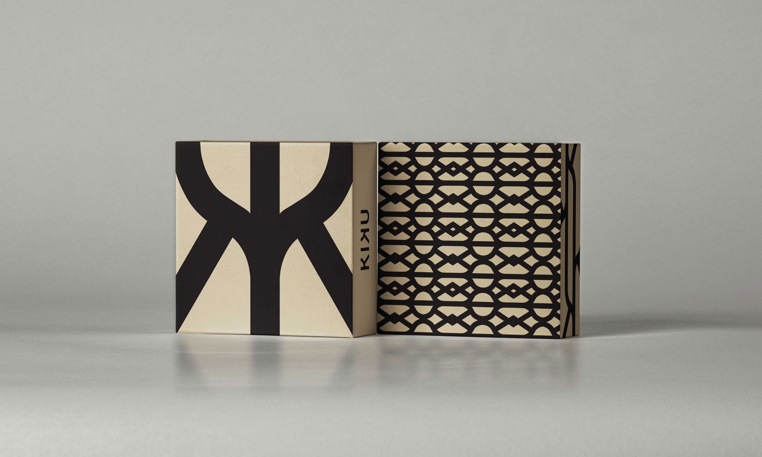
The goal of this project was to build a visual identity that aligns with Kiku’s core values of sustainability, creativity, and modernity. Every element of the brand’s identity, from the logo to the color palette, was designed to reflect a sense of duality—balancing the playful nature of the brand with a commitment to sustainability and purposeful design.
At the heart of the brand’s identity is the logo, which is rooted in the concept of duality. The design uses clean, bold lines to represent both the fun, energetic side of the brand and its thoughtful, minimalistic approach to using resources. The logo is simple yet versatile, embodying Kiku's ethos of “only using what’s needed” in both fashion and design. This not only speaks to the brand’s sustainable philosophy but also makes the logo adaptable across various mediums, whether printed on clothing tags, packaging, or digital platforms.


The design language also emphasizes Kiku's commitment to sustainability. Minimalist packaging solutions, eco-friendly materials, and a focus on waste reduction were central to the brand’s visual storytelling. This not only aligns with the brand’s sustainable practices but also reinforces the idea of intentionality—designing with purpose and using only what is needed.
The resulting brand identity for Kiku captures the essence of Karishma Lalwani’s design philosophy: playful yet responsible, modern yet timeless. The logo and art direction bring together the brand’s lively energy and its commitment to sustainability, creating a visual narrative that is as bold and vibrant as the clothing itself.
Through the thoughtful use of color, typography, and sustainable design principles, this project successfully reflects the core values of Kiku—a brand that believes in balancing style with substance.
Kiku’s identity was built around the idea of thoughtful yet exuberant design. The typography is clean and modern, with rounded edges and soft curves to evoke a sense of approachability. The interplay of bold headlines with softer secondary text reinforces the duality concept, creating a balance between loud and quiet, playful and purposeful. Every design element—whether on clothing tags, lookbooks, or digital media—was chosen to enhance the brand’s aesthetic while staying true to its environmentally conscious roots., but your story will separate this one from the rest.


